Friday, 16 December 2016

Creative Play - Presenting our final piece


Today we presented our final piece for the Into to Creative Play module, and I feel as though we done so successfully. For the setup, we wanted to have the video projected above our physical piece which was placed upon a table. We had some issues during this phase, as it was difficult to have both pieces visible to the audience due to the placement of the projector, so next time we will definitely put more thought into the presentation prior to the event, however after altering the placement we overcame this issue, and I feel we shown the work in the best possible way. Though we sometimes needed to be asked questions during presenting to get ourselves to speak, we still managed to get across our ideas and evaluation of the piece successfully, and the feedback was constructive and appreciated.

I think we took a few risks during this project in the spirit of creative play. For example, instead of sticking with our initial idea to just present our work on boards, we expanded it further by not only creating a more unique and interactive way of presenting our work, but also producing a video along side that, which is something that I’m very glad we decided to experiment with, as I feel that became the centrepiece for our project. Making models of things is something that no-one from my team had much experience with, hence the way we were originally settling on presenting our work on boards, but I feel due to all the experiments and prototypes which we created, we became a lot more experienced in the matter and I think the development of the piece shows this. Despite wanting to take risks, we also ensured that each team member had a task which utilised their unique talents, in order to make the final piece as good as it could be, for example Alice used her talent with watercolours to produce the traditional artwork, I used my digital design skills to produce the modern artwork, and Juntong used his knowledge of editing software to start the production of the video. I feel as though we all contributed to the ideas generation phase of this project, however as I previously mentioned, we were purposely put into groups with two others with contrasting work styles, and those stayed true throughout the topic, as Alice was classed as more of a creative type, and I was one who preferred to be told what to do, which is why Alice contributed the most during the ideas generation phase, and me and Juntong took more of a role during the building of the product.

The brief I feel was met as the theme of old and new was pretty much the founding concept for our project, we added a slight interactive element through the sound and the way in which the piece leads your eye from the jungle to the modern city, we created a physical product, and energy is shown during the transitioning phase of the video. If we were to improve on any element of the piece, I think my group would all agree that we could have made the interactive element more apparent and also altered the scale of the model, as I feel it was small, especially when placed below the projection of the video, however this was prevented due to the size of card on offer. Overall though, I am very satisfied with our result, and the other displays were also very well done.

Tuesday, 13 December 2016

Intro to Creative Play Update

Since last weeks session, I have successfully played around creatively in my video editing software with the video of the pan through our art, and have produced an outcome which is superior to the original in my opinion. Below is the sketch which I made for the original idea for the video. 


I started off by having the idea to redraw/create each first piece from each time period in the style that came before it, therefore we could have each new time period fade into each other, thus showing a more gradual progression between each period, for example, the first piece from the traditional artwork will be redrawn out but instead all the positive space is occupied by a collage, the same as the forest scene. I experimented with this, but after putting it into a video, I concluded that it didn't work, as the silhouettes of the buildings are vastly different and therefore didn't blend in well to each other. Below is the original drawing by Alice (a group member), with the silhouette she created gradually fading to the jungle collage to the right, which in my initial idea would take the place of the first image from the traditional period.

After concluding that I didn't like that idea, I instead played around with other methods of making each period blend in with each other better. I eventually came to the idea that would act as a base for the final video after realisling that as the buildings are panning across the screen, the buildings are in theory getting more and more recent in history. From this, I had the idea that I could have all three pieces from each period loop each other, with the speed of the movement increasing rapidly until the movement becomes nothing more than a blur, thus allowing me to subtly fade in the following period over the blur, and having the new set of artwork slow down to then repeat the process with the following set of artwork. I liked this idea, as it still clearly showcases all of our artwork, but also makes more sense with the context of the piece, as when the pan speeds up, it represents progressing quickly through time, and overall is a lot more effective than the original video. Below is the final video - 


This will be played in loop above the model that we made previously when it comes to presenting our outcomes. The sound was added by another of my group members using audio files from 'Salford Soundsnap', and although I am very disappointed that I didn't utilise Foley to create custom sounds (as I really enjoyed that during our experimentation), I think that the sounds which were collected help portray the time period that the are overlapped over. After at first being hesitant to experiment further with the video, I am so glad I took the risk, as playing with the software allowed me to create a much more pleasing outcome. Below is a screenshot from my editing software showing how I made this video.


This week Alice also managed to finalise our group casebook, which shows all our ideas and work throughout this group project, and we have tidied up our model. 

Saturday, 10 December 2016

Intro to Creative Play - Week 11

After finalising our ideas last week, we have been since been creating all the assets needed for our final product. At home I managed to finish my modern city scape, and I am pleased with how it looks. I used a digital illustrating software to ensure a modern-looking design, relating to the time period itself, and kept to a blue colour scheme so that each segment has its own unique colour scheme, as the forest consisted of mainly vivid greens, whereas the traditional segment had greys and blacks. I tried to give each building a quirky and cartoonish design, which not only creates a juxtaposition between the other styles, but also makes the piece look more interesting, as if I gave all the buildings a realistic square geometric based design, the final piece I feel would look uninspired and bland, when compared to the interesting ideas and art styles of the previous two. Many of these buildings were my own interpretations of famous buildings, most notably The Gherkin from London, but the majority were fabricated out of my own imagination with help from a mood board that I created, using both real world images, and from futuristic cartoons such as Futurama, in order to really push the modern theme. I made these three A3 sheets long, in accordance to the other time periods.


One of my other team members produced the artwork of her chosen time period of traditional/Victorian, and she produced them suitably using traditional methods, and I think that the outcome was very appealing.


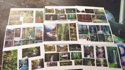
These are the final collages that we used for the jungle segment.


Now that we had all the artwork ready, our team started to experiment the best ways to make the stand that we mocked up last week, making boxes out of various materials to find the sturdiest. Eventually we found the ideal paper, which had gloss which made the boxes look more polished, and held up very well. Unfortunately, there this type of paper wasn’t available in the size that we required to make the stand, however we overcame this by producing six separate 42cm x 9cm x 7cm boxes and stacking them on top of each other to make the different levels. Below are the box mock ups, the net for the final box and what the final base came out like.


After we got that out of the way, it was then time to present the final pieces on them. This is where we came into some trouble, as printing these designs on one A3 piece of card and placing them across the 42cm long base, caused the designs to be very small, and there is no way that they would stand out at that size. We resolved this issue by only using two of the three designs for each setting, which enabled us the print them at a larger scale, and therefore be more noticeable. We cut around each of the cityscapes so that you can clearly see behind them.


I am pleased with how this has turned out, though the only thing I was uncertain about was the lack of each layer overlapping the one behind it, in order to get more of a sense for three dimensions and making the very different designs blend together more, and make the observer feel as though they are a singular piece. This was only a minor issue however, as there is a slight overlap, and overall I think the piece looks very presentable and is a unique way of attacking the brief. At first we were disappointed that not all of our artwork was going to be on show, but then we realised that all of the left over pieces would be shown on the video, which will be projected above our display. The video was also made by one of our team members during this week’s session, and though we managed to accomplished what we set off to do (which was a pan through all our artwork), we realised that the final result was bland, and the different art styles didn’t blend well and the change from forest/traditional, traditional/modern was too abrupt. Because of this, during this weekend I will experiment with alternate ways of making the pieces blend better together on my video editing software. This will be a good way to experiment further with digital design, and take more risks by playing creatively with the effects on offer. The soundscapes were also created this week. I will post the final video here when it is complete

Again, I feel like our team have made good progress, and all now that is left to do is tidy up our display a bit, and put the video together. I am highly anticipating the final result.

Friday, 9 December 2016

I have successfully recreated all four of the bouncing balls exercises in the stop motion room, one of which has additionally been made within Maya. I was very disappointed with how my minimalist research on these objects negatively affected my first attempt at these exercises, so I was hoping that my primary and secondary research (as shown in a previous blog post) would help make a better outcome. The main difference between these versions and the previous ones, is that fact that the whole of the objects movements are recorded until they come to a stop, thus showing the whole process and making it easier to distinguish each object, as they all stop in very different ways.

Ping Pong Ball


This is my ping pong ball animation. I tried to capture the light and small properties of the ping pong ball by making the movement quick, keeping more of a constant speed than most of the other objects, however not without totally ignoring the principal of 'slow in slow out', thus still indicating the forces of momentum and gravity. I am very pleased with how this animation has turned out, as I feel I would be able to assume the object by nothing more than the video, something I know I definitely would be unable to do with the original.

Bowling Ball


As I have mentioned previously, the bowling ball is by far the easiest to capture the movements of, due to the fact that it's properties are vastly different from any of the other objects, and for this reason, my initial animation was satisfactory in my eyes, however I still felt the need to remake it, as I thought it still could have been better. In this version, I gave the bowling ball more of a roll at the end, as a real bowling ball would do. The heavy and hard nature of the bowling ball was indicated by it's gradually increasing yet quick decent, and lack of bouncing after the initial contact.

Balloon


On my previous balloon animation, I knocked the camera by accident midway through the making of, therefore the final project had a wobble, which made the whole video look amateur and messy. I managed to prevent that this time, and also feel I have vastly improved upon the motion itself as well. In order to portray the very light feel to the balloon, I made sure that the motion was slow, and mostly remained at a constant speed, only speeding up slightly before and after it hits the ground. This is because, due to its weight, gravity would not have as much of an affect on it. As a balloon is also not perfectly circular, it isn't always going to progress in the same direction, which I attempted to show in my animation by having the arch alter from long but low and short but high after each bounce.

Beach Ball


This is my beach ball animation. This was one of the hardest to produce, mainly because the motion shares similarities with the ping pong ball, therefore it was difficult to make it stand out as a beach ball. During my research, I discovered that due to the increased size but still relatively light weight of the beach ball, there will be a lot more emphasis on the 'slow in, slow out' principal during each bounce, which I believe I have shown through my animation. It would also likely bounce higher. As mentioned in the research, the video that I used for reference had the ball bounce off of another object, which I felt would be suitable to incorporate into my animation, thus giving me a better understanding of the properties of the beach ball.

Overall I am very satisfied with the progress that I have made on my stop motion animations, as the quality is without a doubt improved, and it goes to show how essential research prior to the making of is. These Exercises have helped me to understand the importance of observing, as little things such as a ball bouncing would be benefited greatly when animating by observing the object itself, in order to keep some realism and therefore believability into your work. I didn't enjoy creating these as much as I did my block interaction, as I felt I wasn't getting my own ideas across and was instead just focusing on accuracy, but I still see the importance and still found some enjoyment out of creating them.

As mentioned, I also selected one of these balls to re-animate in Maya, so I chose the ping pong ball, as I felt that was my most successful one. I followed the same bar sheet as I used with the stop motion version, thus ensuring the same or similar motion. I found this a lot easier than I did in the stop motion room (as always), as I can alter arcs, heights etc. at will.


Saturday, 3 December 2016

Intro to Creative Play - Week 10

I feel as though our group made good progress in this week's creative play session. We have slightly altered our plan for the final product, as we have figured out a way to make a more physical, interactive and appealing display, than just our artwork hung up on some black boards. This idea was to have a stand, where each time period will be elevated above and behind each other with their backgrounds cut out, therefore still showing a progression through time, but in a more effective and appealing way. The idea of having the more modern periods built above the periods that came before it was partially inspired by underground cities such as the lost city in Edinburgh, and the fact that sometimes we build upon traditional buildings and areas. We made a mock-up of what we plan our piece to come out like (inspired by the rapid prototyping sessions) -


The jungle aspect will be aligned along the bottom, the traditional will be in the middle, and modern on the top, as represented by the colours on the mock-up. We have decided to reduce the amount of pieces per time period down to 3 each, therefore we can scale them up along with the stand, and leave time to work on other aspects, such as the sound and video, which will still be shown as planned in the previous update.

During this session, we also managed to get three more of our jungle collages done, which was done before we came to the agreement that we only needed three. However this means that we can choose the best from the ones that we have created.


I think that we have come to some good conclusions, and I will produce my part of the modern city theme and upload them here when they're done.


Here is my first attempt at the weighted bouncing balls stop motion exercise. Due to the fact that next to none research was carried out for this exercise, I was very displeased with the outcome, and knew straight away that I needed to better understand the forces and properties of all four of these before giving it another try. So, by using both primary and secondary research, I have come up with the following.

Ping Pong Ball


Due to the fact that I was severely unhappy with my ping pong ball animation, I captured my own primary research video footage of a ping pong ball bouncing. Using my editing software, I was then able to note down at what frame each bounce occurs, and at what frame the ball reaches its highest point, here is the list that I created -

1st bounce – 0.10 frames (Peaks at 18 frames)
2nd bounce – 1.0 frames (1 second) (Peaks at 1.06 frames)
3rd bounce – 1.13 frames (Peaks at 1.19 frames)
4th bounce – 2.0 frames (2 seconds) (Peaks at 2.04 frames)
5th bounce – 2.10 frames (Peaks at 2.14 frames)
6th bounce – 2.19 frames (peaks at 2.23 frames)
7th bounce – 3.03 frames (3 seconds) (peaks at 3.06 frames)
8th bounce – 3.11 frames (peaks at 3.14 frames)
9th bounce – 3.18 frames (peaks at 3.21 frames)
10th bounce – 4.0 frames (4 seconds)

(After the 10th bounce, the ball continues to bounce rapidly and roll for another 2 seconds)
The whole process – 6 seconds (8 including pauses)
Then to get a better feel of the weight of the ball, I then digitally sketched out the motion that the ball takes in the video. This will help me understand the distance and heights reached after each bounce. This is also on shown over the top of the video above.


From all this research, I have created the following bar chart, with all the bounces and peaks perfectly aligned with the key frames –


Balloon


I was also displeased with my ping pong ball animation, so once again I captured my own primary research video footage of a balloon bouncing. Due to the fact that this is an oddly weighted balloon, due to a light on the inside, I have very slightly altered the speed of the video to better replicate the pace of a real balloon. Here are the frames mapped out as was done for the ping pong ball -

1st bounce – 0.23 frames (Peaks at 1.13 frames) (1 second)
2nd bounce – 2.01 frames (2 seconds) (Peaks at 2.10 frames)
3rd bounce – 2.24 frames (Peaks at 3.08 frames) (3 seconds)
4th bounce – 3.16 frames (Peaks at 3.24 frames)
5th bounce – 4.06 frames (4 seconds) (Peaks at 4.12 frames)
6th bounce – 4.18 frames (peaks at 4.23 frames)
7th bounce – 5.03 frames (5 seconds) (peaks at 5.06 frames)

(After the 7th bounce, the balloon continues to bounce softly for another second)
The whole process – 6 seconds (8 including pauses)


Here is the final bar chart, once again with all the bounces and peaks perfectly aligned with the key frames – 


Beach Ball

As I was unable to obtain a beach ball, I relied on secondary research to work out how a beach ball bounces. I found a very useful YouTube video which is very similar to the videos I myself produced. This clip is also useful because it shows the ball making contact with an object and bouncing back, which is interesting because it helps me get a better understanding of how energy and momentum is transferred/lost, which I will attempt to recreate in the stop motion room.


https://www.youtube.com/watch?v=6Rdq_umMifo

1st bounce – 0.11 frames (Peaks at 19 frames)
2nd bounce – 1.3 frames (1 second) (Peaks at 1.09 frames)
3rd bounce – 1.13 frames (Peaks at 1.21 frames)
4th bounce – 2.03 frames (2 seconds) (Hits object at 2.07)
5th bounce – 2.11 frames (Peaks at 2.15 frames)
6th bounce – 2.17 frames (peaks at 2.21 frames)
(After the 6th bounce, the ball continues to bounce very subtle and rolls for roughly another two seconds)

The whole process – 6 seconds (8 including pauses)

Bowling ball

Unlike all the others, I was actually pleased with how this one turned out, possibly because the weight and size of a bowling ball is so vastly different from all the other balls that it is easily distinguished. I will still redo this however, as I can still see improvements being made. Again, I was unable to obtain a bowling ball for reference, but there is a video which perfectly demonstrates it (The bowling ball doesn't come up until 2:33)

https://www.youtube.com/watch?v=KRVhtMxQWRs

Here is the bar sheet which I created after watching that video -


Hopefully, after all this research that I have carried out, I will make a much better outcome next time that I am in the stop motion room, I will post the updated and hopefully improved version on here when it is finished.


Tuesday, 29 November 2016

Animation Context - Weeks 9 & 10

In this week’s animation context lesson, we were shown a video which analysed how Stephen Spielberg portrayed the terror of war through film, specifically in his film ‘Saving Private Ryan’. I think the reason that we were shown this was to help us with how to reference material and properly analyse pieces of media and/or texts. I feel as though the video analyses its material well, however there is an instance where the narrator uses a quote/opinion from a friend as a reference, which would be fine if you were collecting some primary research of your own, but not as an academic reference. However, the way that this video assesses how the shots, angles and pans are used is very well done and backed up by a lot of proof, therefore this video could help me to better analyse pieces of media, if I were to ever need to. I still do feel like I need a better grasp on Harvard Referencing in writing though, as I only experimented with it a bit when it came to my Storyboard research.

After watching this video, I searched to see if any similar videos were made regarding my favourite director, Edgar Wright. I found one video which is very similar to the one that we were shown in class, but this one instead analyses how Wright uses visual comedy. This video gave me an even greater admiration for this director, and I feel as though many of the points made that are made in this video could easily be applied to animation, and as I am very interested in comedy, it will definitely be something that I will soon experiment with myself. I found this video to be very well made and I was engaged with it throughout.

https://www.youtube.com/watch?v=3FOzD4Sfgag&feature=share

Edgar Wright

Although I really enjoyed this class session, I was happy that in the following week, we journeyed outside room 3.33 for our context session and into an art gallery, as it was be nice to get a change of scenery. In the art gallery in Manchester we were tasked to pick three particular pieces of art that we like and answer some questions about them, I documented my picks and have anaylsed them.


Artist name - Jai Redman
Title and Date - Roses (2007)
Notable features i.e the medium, structure, the narrative - For me, the main thing that stands out about this piece is the juxtaposition between life and death or alternatively beauty and horror. At first glance, I never even noticed that the roses we made out of human skulls, therefore giving me a shock when I initially realised it, which made me remember the piece. For me, I think the artist is trying to portray an insight into how pessimists may observe something that may be beautiful to another individual, as the pessimist is contemplating on the fact that these roses, like every living being will one day perish, which is given a human personification through the form of a skull, in order for the observers to relate more.
This interests me/is relevant to me as an animation student because - I could envision this being in an animated show as a replacement for foliage around a villains base or hideout, which would create a creepy and frightening atmosphere. This has shown me how you can alter everyday objects in order for them to convey completely different emotions than what they normally do, which would be very helpful when attempting to communicate a certain atmosphere in an animated show


Artist name - Briton Riviere
Title and Date - The Last of the Garrison (1875)
Notable features i.e the medium, structure, the narrative - After some very faint research on this piece, I have descovered that this is dipicting a scene from the English Civil War. I would have prefered it if I didn't find this out however, as due to the unclear circumstances and situation which lead to this painting's narrative, it is interesting to assume the full story based upon what you personally portray. I like this painting as it gives an insight onto an element which is often cast over and not considered when generally refering to war, which was the consiquences and lives which animals and pets had to endure during these times.
This interests me/is relevant to me as an animation student because - Without even knowing the narrative behind this piece, I felt sympathy for the subject, though its gaze, posture and grim surroundings. It's a huge testament to the artists ability that he can create that much of an emotional impact without even giving us any context or dialogue. These techniques could be applied to animation in order to make an audience sympathise with a subject.


Artist name - Jai Redman
Title and Date - Portrait of a Man (2015)
Notable features i.e the medium, structure, the narrative - I didn't realise it at the time, but this was produced by the same artist who painted the 'roses' art which I previously anaylsed, therefore showing that I clearly have a preference to his work and style. This very surreal scene amused me at first, as once again a huge juxtaposition is created between the serious and the silly. However, despite their similar premises, I had a completely different response to this painting than I did to his other work, as I mainly just found this one amusing. The observers are lead through the title of the piece, the tones and positioning of the subjects body to believe that this will be any ordinary 'portrait of a man', but will then be shocked to find that he has a huge piece of ham for a head.
This interests me/is relevant to me as an animation student because - Unlike the other two where they inspired me with ways to garner more of a horrified or emotional response from an audience through the medium of animation, this one has shown me how comedy and humour can be created by framing, as I can image a pan upwards being used on this image in an animated cartoon, which would be used for comedic effect when it's revealed to be a piece of ham. 


Animation Context - Week 8

After researching our chosen animation related topic (which in my case was storyboarding), we were tasked to create a poster regarding our chosen area, whilst limiting ourselves to only 5 words. The first idea I had was to lay out the poster as a storyboard itself, and have one of my own characters walk the observer through the stages of creating a storyboard. However, I eventually decided against this idea after realising that due to how storyboards are typically laid out and paced, there would be too many panels, and therefore would not make an appealing and clear looking poster. I did eventually add two of my own examples of storyboards in the final piece however, one of which was a scan of my storyboard for my media film project back in college, and the other was one that I mocked up for this piece, using two of my own characters in a simple situation, to show how movements are recorded on a storyboard. Both of these can be seen at the bottom of the poster. The rest of the poster consists of images of storyboards which I found the most visually appealing, the clearest and the most informative, scattered around in a collage style. For the five words to include, I decided upon adding words which are essentially what a storyboard should include, and the qualities they must have, as I found that would be the best way to quickly inform first years about this topic, as requested by the brief. The words in question are; Movement, expression, clear, dialogue and composition. For decoration, I added a boarder and some of my own typography consisting of yellow and purple (complimentary colours), to attract more attention. When deciding upon the style of typography, I decided to go for a loose and condensed feel, relating to the type of sketching typically seen within storyboards themselves.


In conclusion, I feel as though I have kept to the brief, and the research prior to the creation of this poster was essential. However, after seeing and reviewing the rest of the work, I feel disappointed that I didn’t include enough of my own content in there, as some others were entirely made up of their own content and I would feel a lot prouder of my work if that was the case with mine. When presenting to the rest of the class, I feel as though I improved (judging by my self-feedback on the ‘gestalt’ presentation), but there is still room for improvement.

Sunday, 27 November 2016

Into to Creative Play - Week 8 & 9

In Intro to ‘Creative Play’ my group of three which was created through pairing people up with others whose skillsets will benefit each other, were assigned a brief to create a representation of ‘the city’, whilst considering the theme of old and new. In my opinion this was a very broad brief, therefore it opened many different ideas. I noted down six ideas which incorporated many of the different forms of creation that have been introduced to us over the course of this module.

1.      Create a blank 3D model of a city (either by using 3D printing or modelling), and then using projection mapping, project designs onto the models to change the buildings to appear more modern or older. I felt that this would be a good way to utilise projection mapping.
2.      Use lighting (as demonstrated in the filming session), to represent through shadows the passing of time on certain objects or models of cities, and have the silhouettes and shadows also represent a change in time, such as the style of buildings modernising.
3.      Use the green screen to place two actors (one representing old, the other representing new), and place them on top of artwork of the corresponding time periods, and have them interact somehow with the audience.
4.      Create physical mashups of city related objects and buildings, with half of them new, the other half old. This could also be done with cartoony caricatures of people, showing how fashion has changed over the years.
5.      Create a soundscape of all the different areas of a city, two versions, old and new. This will be created using Foley, a technique which I am very fond of and interested in. These sounds could be activated by pressing a button or by people interacting in any way with the designated areas or objects, this could be done using Arduino.
6.      Have a video play which shows a scan of artwork of city areas all linked up, and the areas getting progressively more modern as the film goes on. This will then revert the traditional cities and the film will continuously loop.


To help introduce us to this topic, we were set a task to plan and create a very simple stop motion which represents a city within only 45 minutes! As a group we decided that due to the time constraints, we should keep it simple, so we made dozens of little clay 'blobs' which were meant to be people, along with clay cars, which would all be walking across a backdrop of a city silhouette. The city silhouette came out very well in my opinion, possibly due to the bright yellow windows we cut out, which creates a huge contrast from the solid black buildings, which is why I decided that I somehow wanted to use a similar premise within my actual piece for this module. Unfortunately the beauty of the animation didn't mirror the beauty of the backdrop, however we did have a lot of fun creating it. Due to the lack of planning on the direction and purpose of all the clay civilians and cars, their movements were improvised during the animation process, which is why some inexplicably get run over and squished. The lack of planning is without a doubt what let the final animation down, but I feel as though what we have made during the 45 minutes we had, has made me very optimistic regarding what we can make for the final project with a LOT more planning.


After refining our idea for the actual piece, we decided to create artwork of cities from different time periods (Traditional and Modern), and have them laid out on separate designated A1 boards. There was also the idea to go even further back than traditional cities, and go back to when there were no cities at all, just forest and jungle, before civilisation, to show an even greater variance in setting and style. There will be 6 pieces of artwork for each time period, so 18 in total, and they will be arranged neatly and link together on the board. As for the designs of the boards themselves, we decided to have them neatly with all the buildings or scenery lined up, with a timeline bellow, in order to show the passage of time. We had the idea to have each board consist of artwork which is created with relevance to the time period they are portraying through the techniques used, for example, the modern city artwork will be made digitally, the traditional city artwork will be made using traditional methods such as water colour painting and the jungle will be created out of a collage. This will also help utilise all the teams’ skills and abilities. As for the actual setup of the project, the three boards will be hung out diagonally, thus helping the observer to understand the journey through time, and as the observer travels through these boards, they will be lead to a projector projecting a video onto a wall, which will be an endless loop of all the artwork linked together, as the frame pans through it all, showing a progression through time. This will all be edited and pieced together through After Effects, and the video will go along with some accompanying soundscapes, which we will make using Foley in a recording studio, however for the remainder of the sounds which we cannot accurately reproduce, we will use Soundsnap.

This is our idea as it stands right now, and I think that it incorporates a lot of the techniques introduced to us, and I am highly anticipating how it will look once it has been completed. During this week’s session, we also managed to make a mock-up of what one of the pieces from the jungle aspect of the work will look like, and we were impressed with the look.


A outline of a cityscape was drawn, and using cuttings from imagery of jungle, the positive space was occupied. I feel as though this creates an interesting juxtaposition of two very contrasting themes, the jungle and the city.

My next steps to take in this module is to gather visual research of all three different areas, and create a few of the digital pieces of artwork for the ‘modern’ aspect of the piece.
https://vimeo.com/193271802

This is the Maya remake of my stop motion 'block interaction' in Maya. Following the feedback that I was given from my initial animation, I was able to improve upon many of the aspects that were critisised, from both an technical and a story point of view. From a story point of view, people claimed that the block who was being crept up on didn't react realistically when turning around, as the second turn was exactly the same as the second, meaning that the block is not at all suspicious or phased about the approaching block. The way in which I have solved this issue, is by making the block turn around quicker the second time, and have it pause for longer. I also added an extra turn for the block, to make it seem as though it is trying to catch the other block out. From a technical point of view, I made the dash from the creeping block at the end a lot quicker, in response to my criticism that I gave myself last time, and now I think that the dash looks a lot more heavy. Also, the eyes from one of the blocks were removed, as I thought the story wouldn't have been clear without them, but after watching the remake without the eyes, I can conclude that the eyes weren't necessary, showing how you can make a story using only very basic assets. I am very pleased with how this has turned out, and I had a lot more fun producing it, possibly due to the increased preparation that was made. Below is the bar sheet for this animation.


Tuesday, 22 November 2016

'Making of' - Week 9

During this session we were tasked to research independently 'Pantomime Animation'. I have found several videos which show what seem to be some good examples of pantomime animation, which has given me a good idea on what a pantomime animation is;


From these videos, I can gather that pantomime animation is a silent form of narrative, where in order for a viewer to gain an understanding of the emotion and drive for a central character, actions as well as facial expressions are often exaggerated, and characters rely on the motions of their arms and hands to put emphasis on their mood. The exact definition of pantomime is as follows:  


Which aside from the music aspect, all these videos accomplish perfectly. It seems as though each animation features several distinct, clear and strong poses which would have an appealing silhouette in order to lead the viewer into important actions whist being visually strong. I'm sure that timing is a huge priority when animating these characters, as it would help to show where the effort and speed is being applied to their actions. My favorite of the three is the second one, as all that we see the character do is ring a bell to get someones attention, but without the need of dialogue we clearly get a sense of his irritated attitude, all though they way his eyes lead to show his intention, his facial expression and arm gestures. I have a lot of interest in comedy, so I feel that this is a perfect animation method that I should try out sometime as it offers some huge opportunities in terms of slapstick.


Weekly update on my 'Ongoing Project' #2

This week I managed to make four new Simpsons Celebrity Caricatures, all of which are based on characters from the TV show 'The Inbetweeners'.

Sunday, 20 November 2016

Animation Context - Week 7

In Animation context, we were tasked to pick a topic relating to animation and research it. I decided to choose 'Storyboarding' as it's an area that I am interested in

Storyboarding

What are storyboards?
Storyboards are an essential aspect of the preparation of any professional animation. They are most commonly drawn by hand, and their purpose is to plan all the dialogue and movements for an animation or film. Before the making of a storyboard, the artist receives a beat outline, which maps out the subject’s emotions and the actions that accompany them. With the beat outline, the artist then draws out how he/she envisions the scene to play out shot by shot, the work produced is then pitched to a director, however in most cases, the initial storyboards aren’t final, as they are commonly revised multiple times in the development process. This process is carried out after the scriptwriting stage.

Why are they used?
The main reason a storyboard is essential, is the fact that it is used to help the animators to gather a feel for what the project would look like as a finished product, and to see whether it would work. It also is arguably the best way to communicate a vision to others, such as the directors, as a script simply wouldn’t visualise the idea enough for a clear understanding. Creating a storyboard will also help plan what shots will be needed, where they need to be taken and what kind of shots they will be, this may not be as important to animation based projects, as they don’t require filming on location, but it still may help when preparing the assets needed. Creating storyboards also helps you to not forget about any scenes.

What skills are required to become a storyboard artist?
I found a very useful website which outlines all the skills animation storyboard artists should have- http://creativeskillset.org/job_roles/349_storyboard_artist_animation
In summary, a wide understanding of film production is required, mainly because of composition and layout, you must be a good illustrator, but also can adopt established styles for the specific title you are working on, and presenting and computer literacy is also somewhat essential.

What is the layout like?
Layouts vastly vary from studio to studio, and there is no required design or layout that storyboards need to stick by, but the genuinely have a box for illustration accompanied by a space for dialogue and stage directions to be written for each shot.


As you can see with this one, lines are clearly included to show the movement of the camera and mobile assets within the frame. 


This one is from the very famous Pixar film, ‘Up’, and unlike most storyboards, this one is physically laid out on a wall, which is something Pixar and many other animation studios commonly do with their projects.


This is a storyboard from the animated show, South Park

Quotes from experts and authorities
“In animation, it is so expensive to produce the footage, that unlike live action we cannot have coverage. We can’t do multiple takes of a scene. We don’t have extra handles, we don’t have B-roll, we don’t have any of that stuff. We have one chance to every scene. So how can you possibly know you’re choosing the right thing?”
            - John Lasseter (Pixar)

“I loved being asked 2,000 questions a day, storyboarding every move, knowing as though by instinct exactly where the camera had to be, because it was my story.”
- Richard E. Grant (Actor)

Magazine and newspaper articles
http://elearnmag.acm.org/featured.cfm?aid=2024072 – This is a link to a digital article from ‘E Learn’ magazine, where Kevin Thorn summarises the importance of storyboarding and how it’s done.

https://www.learningsolutionsmag.com/articles/962/nuts-and-bolts-storyboarding-basics - This is a link to a digital article from ‘Learning Solutions magazine, where Jane Bozarth discusses her involvement with storyboarding


Wednesday, 16 November 2016

Weekly update on my 'Ongoing Project' #1

Since starting this project one week ago, I have managed to make 6 more additions to my Simpsons caricatures. As I previously stated when I started this project, I planned to add some characters drawn in an alternative style to the Simpsons, and I have done that this week, however I have kept them related to 'The Simpsons', as it is characters from the Simpsons who are drawn in an alternate style (Rick and Morty). In addition to them, I have also drew two of my friends for their anniversary, and also Rick and Morty themselves. I am still satisfied with my decision for this ongoing project, and I am anticipating what others I can produce in later weeks.