Monday 11 December 2017

Making of Integrated Practice- 
Week 12
Evaluation for Making Of Video

https://www.youtube.com/watch?v=fqArUAAsMrc&t=496s

In previous modules, I always enjoyed producing making of videos, as I feel its the best way to communicate your processes of production, and this was no exception. Josh took charge of the editing, but I was always there to overlook what's going on, whilst suggesting certain additions, as did Chloe.

What went well
  • We included a wide variety of footage in order to keep the 11 minute video diverse enough to keep audiences attention, the types of footage that we included are as follows; behind the scenes recordings, screen-records whilst working on project, showcase of final work, clips from external sources that inspired us and more!
  • From past experiences, I have realised how essential it is to record my process of animation whilst it is taking place, which I done so this time, and it is shown at a couple of times in the final video. I done this as I use non-typical techniques for animation, therefore by visually showing how I animate, it builds a much better insight for the audience than me simply explaining it.
  • I designed certain graphics which pop up with some text throughout the video, explaining where an external source came from, which not only gives a consistent sense of design which mirrors our team logo, but also adds an extra layer of professionalism to our video, as that is what many industry videos of the same nature do. 
  • I feel like 11 minutes is the perfect length for what we had to showcase, it has no filler and we never brush upon potentially important topics. Anything over 15 minutes or under 5 wouldn't be suitable for what we produced.
  • The video is structured in a way that it does justice to the work that each of us put in, as we all get roughly the same screen-time, which is suitable as I feel that we more or less distributed out the job roles equally throughout the project.
  • Not only did we have a variety of shots, but I think we also had a lot of varied locations included, which once again, offers something new for the viewers to see every now and then. These shots consisted of; Green screen room, Foley studio, working environment and more!
  • A very simple touch that I liked was something that Josh added to the piece, and that was a small clip of footage from each of the English writing students that helped us out, where they explain what they like about how the story has turned out. It was a good touch to have our collaborations give some feedback on the project as appose to it being all us three.
  • Something that I dislike doing in projects such as these, is treating it too seriously (obviously dependent on the context), so it was very satisfying to add an overly cheesy, fake and hilariously bad (on purpose) introduction, complete with 80's sitcom music.

What could have been better
  • As we have a video file of us narrating, I feel that at times we might have relied too much on showing that footage, instead of opting to show something else potentially more informative on screen, as no real value is added to watching us speak. This was handy to have however, as it meant we always had something to show.
  • This isn't an issue with the making of video necessarily, more with the project, but I think the fact that I didn't fail to any large extent, meant that I was more descriptive rather than evaluative in my narration. This was likely because I didn't take to many large-scale risks therefore never had to work around problems, making for somewhat of a more bland commentary.

What I will change next time
  • Instead of tending to talk about the work that came out of the project, talk more about issues I faced, as that makes for a more entertaining video.
  • As I said, I like adding elements of comedy to these types of videos, so it'd be refreshing to keep a humorous tone throughout, making for a more entertaining and original video. 
  • When recording the making of narration, due to the fact that none of what I said was scripted, a lot of things came to me after recording that would have made good talking points for the video, and as we no longer had access to the professional studio that we used to record our audio, I couldn't add them at a later date. This has shown me the importance of planning what it is I want to say, which is definitely something I will keep in mind in future projects.
Creative Collaboration- 
Final Group Presentation

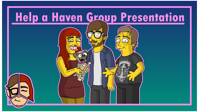
As another way to present the work that's gone on throughout this project, we were tasked to perform one final group presentation. Due to my disappointment with not being as active as I could have been whilst creating the production bible, I opted to design the presentation, therefore having another opportunity to utilise my graphic design passion. Josh listed what he thought we should cover throughout the presentation.

In terms of the Powerpoint slides, I tried to keep them simple, consistent and clear, as I felt it was the work that needed to be the central focus. I used the team logo that I designed as a way to indicate who's responsibility it was to speak for the given slide, a method which proved to help flow a lot whilst presenting, as well as adding a personal touch to the presentation. I included as little text as possible, in order to prevent our eyes from being glued to the screen, reading word for word what our audience can plainly see.

As I said in a previous blog post, I am not the most confident during presentations, however I was a lot more so going into this one, this was probably a combination of being enthusiastic about our work, and the fact that I am presenting with two others. After completing the presentation, I am satisfied that I mentioned everything that I intended to say, but I still have a lot of room for improvement, as I was still prone to not making much eye contact with my audience.


Creative Collaboration- 
Weeks 10 - 12
Evaluation for final animation & Production Bible

https://www.youtube.com/watch?v=LaLjM4djPIM&t=16s

After 6 weeks of production, we finally managed to get our final piece animated, and it is insanely satisfying to see all of the group and our collaborator's  work come together. There is a lot that has turned out just as good, if not, better than I expected, however there are a few things which I think might not have been up to standard with the rest, all of these points are listed bellow.

What went well
  • We managed to produce an animation that's entirely of our own creation (with help from all our collaborators), we didn't go off of any pre-excising franchise or organisation, therefore creating something original that has the potential to be developed even further. This is something that I've always aspired to do in a scale such as this, but never had the opportunity to do so due to not having external collaborators to assist me, therefore often resulting me in expanding on other peoples intellectual properties.
  • Despite originally being unsure whether or not the topic of our choice would be applicable to the 'Creative Conscience' brief, as the majority of topics concern issues relating to human welfare, not animal welfare, I believe that we have worked around it, and have worked strictly to the brief set.
  • I am very glad we chose to structure the animation in the quick-cut fashion that we did, as I couldn't see us being able to communicate the story we intended in the time we were given otherwise. The effect, regardless of its time consuming nature, is very effective as well in terms of communicating emotion.
  • After testing our animation with someone who fits into our primary target audience, although not getting as quite into it as we first intended (I understand we only tested this with one individual, and results will vastly vary from person to person), she still managed to grasp the issues we were raising and overall experienced the emotions that we intended her to feel, therefore meaning we pulled off what we intended to (the video can be seen below)
  • I could see this working as a TV advertising campaign, releasing several alterations, all of which focusing on a new dog's story. This isn't a happy coincidence however, as one of our main inspirations was the Dog's Trust '#specialsomeone TV advertisements, which has a very similar premise to our own. This means that our piece is highly marketable, and therefore is good practice for industry.
  • From this, I have produced an even wider catalog of characters designs, an area of production that I am especially passionate about, and I feel as though I have improved my skills in the process, especially in terms of turn-arounds and posing.
  • We worked with many professional people who helped to make our project as good as it could be.

What could have been better
  • If I was to point out the largest problem that I came across whilst animating, it would be the timings. Unfortunately, when it came to animating some scenes, timing had to altered in favour of spreading out events so they're easier to comprehend. The most server one of these adaptions was as follows; Tony was originally meant to appear in the scene in the streets, offering Talula a treat, but due to the fight having to be extended as I wanted to build up tension and threat, there was no longer time to include his appearance. Fortunately, this wasn't a major plot point as his care for Talula was shown in other aspects of his character. I have learnt from that experience how to pace things out better in the pre-production phase, to save me having to rearrange things later and cause more work for my teammates. 
  • The fact that the whole animation had the same framing throughout, meant that I wasn't able to use cinematography techniques to help emphasise certain emotions and atmospheres. This is especially apparent in the scene where we are meant to be fearful of the mean dog, Tyrone, as preferably, he should have consumed more of the screen and been shown from a low angle to signify dominance, however due to the locked angle, this wasn't achievable.
  • It was important to establish that a lot of time is passing by after each shot, and it wasn't just poorly made animation. We originally planned to show this via the background changing overtime and Talula slowly growing, which was achieved excellently in the 'pregnancy' scene. However, arguably the most essential scene to let the audience know this is in the establishing shot/scene, so that they understand right away what's going on. We unfortunately didn't show this overly well, as despite from the dogs disappearing in the background and price going down, there is little indication towards the passage of time, meaning that the audience may be initially confused
  • I feel as though overall, our piece could have been a lot more informative, as aside from all the situations portrayed through narrative, no facts or figures are displayed, making the research that went into pre-production somewhat redundant. It wasn't necessary for the piece to be overly informative, so it's not a major concern, but facts and figure would likely help audiences take the message more seriously.
What I will change next time

  • Have an even more active role when contacting and meeting collaborators, as although helping out as much as I could when we came into contact with them, I always felt that I could have made the project a little more interesting by searching for my own potential collaborators to cover more fields.
  • Experiment with more fluid animation, learning and pulling off this style of animation was fun and made for a pleasing outcome, but I feel that skills learnt by perfecting my traditional animation techniques would be more beneficial in the long run.
  • Use more industry standard editing/animation software, so that other team members could help a lot easier as they would likely have experience in software's other than the ones that I am using, and therefore animate with my animation rigs, thus helping take the pressure off me. This will also help increase my employability. 

Team Report

I feel that myself, Chloe and Josh worked exceptionally well as a team, and came over many issues together, helping with or taking on jobs that others didn't have time for, ensuring that what they're working on in the meantime is to the standard that they want it to. We all live in close contact to one another, so it was easy to contact one another. I feel as though I wasn't hesitant to politely bring up anything that I wasn't particularly happy with for the good of our project, something that I have failed to do before, and I hope that they feel the same way. I would work with these two again, as our different abilities mixed well.


https://issuu.com/levipeirson/docs/helpahaven_productionbible_final_817ee68d93bc91

Above is the link to view our production bible, we were tasked to produce it for our project. The importance of creating this comes from the fact that it is once again professional practice for industry. A good production bible should clearly detail a projects premise and setting, character bios, design variants, poses and an in depth look into the work behind the project. I feel we included all the relevant material, and left out what we thought was unnecessary (ideation notes, all the different background variants, as we wanted to keep the bible looking varied and engaging, not pieces of paper and repeated shots). 

Unfortunately, I was still working on the animation whilst Chloe and Josh initiated this task, so I wasn't able to have as much of an impact on the design and layout as I wanted, due to my passion with graphic design. Chloe nonetheless managed to pull of a presentable and clear layout design, showing our work clearly and appropriately.

Saturday 9 December 2017

Making of Integrated Practice- 
Weeks 9 - 11

After all the characters were made, and whilst Chloe was working on all other assets, I produced an animation test on one of the simplest scenes, the car scene at the beginning. I timed each shot to last exactly as long as each shot lasted in the original Simpsons clip that we were imitating, therefore hopefully producing the same intended effect. Below is the Simpsons clip we used, and following that is my animation test.


Fortunately, I was able to right away emulate the style that I was going for, meaning that this test animation was worthy for the final piece. I then proceeded to do the same with every other scene in the animation, this was a very time consuming task, as I not only had to redraw Talula's expression and pose (if necessary) in response to the situation and background in each given shot, but also had to monitor the goings on in the background including giving life to the side characters if applicable. In order to get the effect that these are a sequence of photographs that have been taken at different times of a sequence of days, as appose to it looking like an awkward and jumpy animation, I made sure that assets subtlety jitter about from frame to frame, such as what was pulled off in the Simpsons clip. These jitters vary in aggressiveness depending on the situation, such as whether or not the scene is moving in the car.

A selection of Talula poses, rendered as PNG's from Serif Draw Plus

A section from the timeline in Sony Vegas, my editing software

During certain aspects of making the animation, I recorded my PC screen as I posed certain characters in Serif Draw Plus and positioned and edited them in Sony Vegas. I felt that this would be good practice for the making of, as I am using practices that aren't typical to industry, therefore a straight recording of my process would be the best way to communicate insight into the way I work. I imagine me voicing over this is the final edit of the making of, explaining what I am doing and why I think it's an efficient method. This would also work well with the video footage that Josh gathered of me working on the animation.


As Chloe produced each background for us to work over, I notified her with what I want altering from frame to frame, therefore she could produce many different alterations of that background for me to use in the sequence.

In order to get accurate timings for my animation, I timed it perfectly along side the animatic that Chloe and Josh worked on previously, that way I can successfully communicate our intended group vision as planned, and also have the animation work around the music and foley that the other team members work on accordingly. The animatic can be seen below.


When posing characters, the geometric shapes came in very useful once again, as they served as an excellent base to draw around. Making sure not to resize, distort or separate each shape, I re-position them to resemble the posture I desire, using visual reference if necessary, therefore getting all of the body proportions accurate when drawing around them. This method has been an ideal way of drawing my characters, and because of it I don't think that any poses look odd or out of proportions. The stages that

The process of posing the character
As you can see from the image above, I have been ensuring that I have been saving each stage of development when working on any major asset to the project, as I am sure this would come in exceptionally handy when editing the making of, due to it breaking down my process into four clear steps.

Page turnings were added throughout major changes in the story to signify a large change of events, like a new chapter in a book. This not only helped to reinforce that this story is being told through a storybook, but also helped to mask large alterations to characters in terms of age and state, meaning that I wouldn't have to show a gradual progression and therefore creating a load more character models.

Due to the way in which I have structured the animation, I wan't able to utilise alternate shots and angles to emphasise certain emotions and threats, as the frame always had to consist of direct approach of Talula, thus keeping to the structure of animation that we established at the start. The scene with 'Tyrone', the tough street dog is a scene that is especially effected by this issue. Fortunately though, I managed to impact the emotion behind the piece in alternative ways, primarily through colour. My favourite example of this is the scene where Talula is left outside, as the navy-tinted colour scheme helps to establish the mood without it becoming too dark that it looks dull and hard to see, and it also contrasts with the bright colour pallette used in the previous scene when Talula was happier.

Screenshot of what I feel is a strong use of colour in the animation
Once the time consuming process of animating that sequence was done, I then proceeded to produce the keyframe animation to go at the end of the animation. This is the animation practice that I am most familiar with, so this was a relative breeze to go through.

The first step was to separate the model of Talula into individual assets, so that they could be moved, rotated or distorted individually without disrupting other elements of the model. These then have the ability to be keyframed individually, making up a new pose for the model, allowing the software (Serif Draw Plus) to animate the inbeween frames, thus creating a fluid animation. Timings and easing paths were also set for each keyframe, in order for my desired effect to be achieved.

Due to the fact that we only planned for Talula to simply look up towards the camera happily, I wanted to put as much life into that simple gesture as possible, which is why I separated Talula into as many different assets as I could and had them all accordingly bob up and down joyfully in different ways, the result of which, worked exactly as I planned.

The animation components for Talula
I understand that this isn't normal practice for keyframe animation, as most programs centred around animation have tools prepared for you to make your own animation character rig, but as the program I use isn't dedicated around animation, I had to make one of my own. This unfortunately isn't good practice for going into industry, as if other people/colleagues were to pick up this file and want to begin animating with it, they very likely wouldn't know how to do so, and this file wouldn't be compatible with industry standard software anyway. This has shown me that I should really start to use a more widely used professional software if I wanted to go into that profession legitimately, but I am proud nonetheless with how I have managed to work around this issue and still produce something that I am proud of.

As this was a new method within this project, I felt it essential to again record the process from my computer screen, therefore showing insight into all my different methods that were utilised in this project.


After the keyframe animation was done, our team all went to a green screen room that we booked out in Media City to record the live action footage that would act as the opening and closing scenes of our animation. The footage was of a book that was decorated by Chloe to have the first and last inside pages to consist of the first and final frame of our animation middle section respectively, opening and closing whilst placed on a table, before the camera pans out, filling the frame with nothing but the green screen. This was needed so I could chroma-key out the green so that I could place the animated keyframe animation behind the table, thus mixing live-action and animation to produce our final scene.

Us working in the green screen room

As for editing the 2D animation and live action together, it was a relatively straight-forward process, The only issue was making the pan up on the camera mirror the pan up on the background. If I was to animate the pan in the background, I would have to redraw Chloe's design background several times, at different angles, a very time consuming process. Fortunately, I worked around this my adding motion blur as the background emerges into frame as I sped up the speed of the pan on the live action footage, which successfully masks the lack of a tilt in the background .

The decision to include this was done as a way to make less work for myself, as deadline was approaching so I didn't think I'd have time to animate a book opening and closing effectively, so we went back to our original plan of filming this segment in live action. I would have liked for our entire piece to be animated, but the final result of a mixture of mediums ended up really effective, and didn't look as jarring and off-putting as I originally predicted it would. It works from a narrative point of view, because as the frame zooms out of the animation and into the real world, it suggests that that story is over, therefore making it more of a surprise when the camera pans to see the animated dog in our world.

Friday 8 December 2017

Making of Integrated Practice-
Weeks 7 - 8

After getting the majority of the assets and planning done for my side of the animation in the previous two weeks, I decided to finish that off at the start of week 8 by creating models for all the remaining side characters. The design process for these were exactly the same as what I went through to produce Talulah, though for the human character designs, I produced my own initial sketches to base the digital drawings around, as I was no longer using Chloe's character designs. I made sure to capture all design iterations as I went through them as I knew that they would be essential to show in the making of to show how my ideas developed. 

Tyrone
Tyrone was the dog that we planned to attack Talulah whilst she was out on the streets. In order for the character design to compliment the motivations and actions of this character, we wanted to ensure that he looked; menacing, rough/scruffy, intimidating and mean. The inspiration for this design came from Chloe's sketches when she was creating potential designs for Talulah, where she sketched a dog which appeared far too mean to be a sympathetic character, though oddly fitting for this character. We were originally going to have Tyrone be apart of a small group of troublesome dogs, however we scraped this idea due to time constraints. 

Chloe's initial sketch

Alternate design iterations

When interpreting Chloe's design, I planned to give it a stereotypical 'gangster' look by giving it a large cigar, in order make it easier to establish as the bad guy and add an element of cartoonish comedy to the piece. however as this animation is dealing with a serious topic, and the situations portrayed are centred around gritty realism, we decided to scrap this idea in favour for some sharp bottom teeth, thus adding to the threat behind him. The initial colour scheme was also altered to prevent too many similarities being drawn to the Beast from 'The Beauty and the Beast', as their facial structure and features slightly resemble eachother.

The  facial structures using simple geometric shapes

Tyrone Character turnaround
Overall, I am reasonably pleased with this character design, my only concern is whether or not this dog will be intimidating enough on its own, without the group that we originally planned to accompany him, but hopefully the facial structure that helps to emphasise his angry expression and features will help this problem.

Cassie
Cassie is perhaps one of the most prominent characters throughout the animation, as she has an entire scene dedicated to her, which is where she becomes pregnant after adopting Talulah, resulting in her neglecting and eventually abandoning Talulah. This character was a lot less 'black or white' in terms of personality, as she isn't necessarily an evil character, although is careless and is the main reason for Talulah's life going downhill, meaning that the character design needed to be more subtle. These following factors are what I took into account when designing this character; she's in her mid 20's, she's attractive, she's unsure what she wants in life, she's single and she's careless. Due to my experience with human character design, I opted to design Cassie and all other human characters, so I grabbed a sketchbook and sketched out some ideas for how she could look.

My sketches of Cassie concepts
My two favourate designs were the two on the second row, due to their interesting silhouettes and memorable and unique features. Although looking the most interesting, they weren't necessarily the most fitting, as one looks far to young, whist the other looks too old, unattractive and mean. So it was for this reason that I decided to make the final design using inspiration from the 3rd and 4th designs down the first column, as there are much more realistic and suit the character more.

Original Cassie Design
This was the first digital design that I produced of Cassie, I was happy with treating this as my final design, however after feedback from Josh and Chloe, I realised that maybe this design wasn't appropriate for the following reason, in an attempt to justify her becoming pregnant after a one night stand, I made her outfit and makeup rather 'showy', which in turn, has caused her to look inappropriate for our target demographic. This was solved by making her clothing less relieving, toning down the makeup, and changing her primary colour from red to purple, as red is a colour used to signify lust and attention.

Cassie's turnaround using simple geometric shapes
Cassie Character Turnaround
I am very pleased with how this character design has turned out, and the process of designing her has shown me how important team feedback can be, as I feel like this was made a lot better and more appropriate after hearing some constructive criticism.

Tony
Tony is the old gentleman character that ends up adopting Talulah and the end of the animation, and is the character that cares for her the most. It was for this reason that Tony's design should help portray the following characteristics; loving, old, passionate and alone. Unlike Cassie, I didn't have to produce a page full of design iterations, this was because there was a single design which appealed to me straight away, and it was found in a page of random character sketches that I made with no connection to this topic.

Random Character Designs
The design that I took inspiration from was the third down on the third column. What made me decide that this would be a good design to use as a base, was the fact that he has a lazy eye, which is something that Talulah suffers with, meaning that it would be more understandable that he would sympathise with her, therefore it makes sense that he would adopt her. It wasn't only that factor that made me pick this design though, as I feel that the design relates to all of the characteristics that I previously established.

Tony's turnaround using simple geometric shapes
Tony Character Turnaround
There was very little change in how I initially (and unintentionally) sketched Tony, and to how he looks above. The only factors that were altered/added were as follows;
- In order to show an even greater resemblance between Tony and Talulah, I made sure that Tony was missing an ear (I made it half an ear so that it becomes more clear to the audience).
- Instead of the smart getup that you can make out on my initial sketch, I decided to draw him in an attire that relates more to the everyday person, and had him wear them in a way which is stereotypical of his age (trousers lifted high on the body).
- The colour scheme of the jacket is yet another way of relating him to Talulah
- The body posture is hunched back to signify his age
These factors made for a character design which I think would do justice to the small role that he plays, though not being as impressive as I found my Cassie design to be.

Making of Intergrated Practice-
Weeks 5 - 6

Once we decided upon delegating all of our team roles within Creative Collaboration, I then proceeded to make a start on one of my agreed roles, co-character designer.

As lead character designer for the dog, Chloe began on designing the central character for our project. At first, we were planning on basing the design on a dog which we had access to, therefore we could use the same dog in the live action footage at the end, but we decided to scrap this idea as we wanted to be more free in terms of character design, giving the dog our own quirks and characteristics. This meant that the opening and closing scenes would have to be adapted from live action to animation, as in order for the payoff at the end to work, the same dog would have to appear in the happy home. Due to her love of pugs, Chloe based the initial design on that breed of dog. Our intention was to give Chloe the role of lead character designer, but then as I am in charge of animation, I will interpret her design in my own style, simplifying it so that it would work better in an animation. However, we still plan to use her illustrations for the opening and closing pages of the the book, as it would make for a more effective morphing when transitioning to the animation aspect.

Chloe's initial sketches

Chloe's near finalised digital sketch
We wanted the audience to sympathise with this character, so we gave him certain characteristics that would help evoke empathy and fuel connection. This was done by giving him a lazy eye and a missing ear, as not only does this provide a more distinct silhouette, but it puts him in an understandably difficult situation, as only the cutest and perfect dogs are sought after, meaning that this asymmetrical one would typically be left behind. This trait was inspired by Nemo's design in Pixar's film 'Finding Nemo', as whilst not being revolutionary, it still manages to provide a sympathetic disability without the character becoming grotesque and hard to watch. 

As I previously mentioned, I intended to translate Chloe's design into my own simpler, digital design. Before drawing straight, I assembled the proportions of the dog using simple shapes in my software, the reasoning behind this was to create a base which I can manipulate and then draw around for each individual pose in the animation, thus keeping accurate proportions and making it easier to draw from different angles. There were a couple of alterations that I made to Chloe's design which are as follows;
- Instead of having the left pupil drop lower than the right, I had the left eyelid drop down, and the whole eye position lower than the right eye, this would hopefully make it appear as though the lazy eye causes more of a struggle for the dog as he is fighting it.
- I made the colour scheme lighter and more accurate to an average pug, this was so that details would be more visible universally across screens, as if its too dark, the lines would blend in with the form, and therefore becoming unrecognisable.
These changes were discussed with Chloe and approved by her.

The structure of the dog using simple geometric shapes

Original colour scheme


My final digital drawing of our main character
Now that we had the character design finalised, I proceeded to create a 180 turnaround for the character. This is not something that I am new to, as I have ensured that it is a regular practice with all my animations, in order to get a better sense of the characters form, and thus preventing me from guessing how a character would look at a certain angle midway through the animation process. This time however, I am interpreting a design which is of a much higher level of detail that I normally use in my animations, meaning that assembling the form of the character from simple geometric shapes was vital, as I could align them all accordingly, adjusting them accurately for the angle, and then re-drawing the dog digitally over that base.

The structures using simple geometric shapes

Final 180 turnaround, with some lower angles added
I was pleased with how the turnaround has turned out, and I feel that the lack of an ear really helps to define the character and give him an interesting look from each angle. Regardless, I do have one criticism with the final result, and that is to do with the body. In a typical turnaround, it is essential that all the features of a character align up horizontally with their rotated counterparts, which I have done well with the facial features, but due to the neutral body pose that I decided to draw the dog in, in order to create a sense of depth and therefore look natural in a scene, I had to have the back legs situated above the front legs when they're positioned behind them, meaning that the heights of the legs and other body features had to be altered as the body shifts in direction. This may have resulted in a less than accurate result, but due to the depth that I have provided, these assets wouldn't look out of place and flat in a scene, meaning I could re-use them in the final animation. Though I still understand the importance of a highly accurate turnaround and is something I will consider in future projects, I feel that this has still been an effective method of visualising the character fully, and will help me a lot in the animation process.

Thankfully, we had a rough idea on how the story within the book will play out, meaning that I knew that I was required to go through the same process of designing the character again, but at different stages of his life. We decided to produce two more designs, one of him as a young pup, and another of him as he becomes old and weak. Chloe once again drew the initial sketches of how she visioned the dog to look at these stages, which I then went to adapt and turnaround in my style. It was also at this time that we decided upon a gender and name for the character, Talulah.

Chloe's designs for the three separate stages of the dog 

There were certain separate characteristics that we wanted to maintain in each design, which are as follows;
Young 
- Symmetry increased to indicate perfection
- Eyes larger to increase cuteness
- Shorter and chubbier to show that she's younger
- Whilst still being cute, prevent her from becoming too perfect that she looses sympathy
Old
- Scruffier hair to indicate lack of grooming
- Duller colour pallet to indicate age
- Head sunk down, front legs more open to show that she's struggling to support herself
- Lazy eye made more evident
- Skinnier to show her deteriorating health
- Ensure that she is not too grotesque and tragic that she becomes uneasy to watch

With these features in mind, I proceeded to draw them both in my style, again using the shape structure. In order to morph each design into the next more naturally in the animation and ensuring that the audience recognise that it's the same dog, I toned down certain exaggerated features in Chloe's sketches, particularly in terms of proportions.

The structures using simple geometric shapes
Final character designs


How the geometric shapes are utilised

Turnaround of young Talulah
What I thought would be a simple task of altering proportions slightly for each age turned out to be a very time consuming task, as hardly any assets from each design were translated unaltered, meaning that each design had to be remade from the ground up. I am very happy with how both alterations turned out though, and through the postures and key features of each design, I have managed to create a character with a complex and eventful backstory waiting to be explored for the narrative when it comes to form. However, I don't think I would have been able to produce the same quality of work if it weren't for Chloe's initial visions, showing me how effective combining skill-sets can be, as it has never been something that I have fully embraced until recently. The next step to fleshing out this character would be to draw out key poses for each of the designs.

What I, personally have left to accomplish in the following weeks is as follows;
- Expression sheet
- Development of secondary characters
- Pose sheet
- Animation tests
- Start the final animation
Making Of Integrated Practice -
Weeks 3 - 4

In response to our previous task, mine and James' collaboration was well received by peers, and it was great seeing it on the big screen at a showing in Manchester, as well as seeing how others have interpreted this mini-brief. Me and James also managed to make some art boards displaying the 'making of' our short animation.

Art Boards

Within these two weeks, I thought that as this entire module is leading up towards a final making of video, it would be beneficial if I were to research some pre-existing making of videos, to see what works well with them, and whether or not there are any aspects that don't hold my interest and how I could change that within my own making of. I selected three making of videos centred around three different properties that I enjoy, as I would be the intended audience to these videos, and I have also analysed a past making of video of my own, to see how I could improve my skills from then.


This is the making of 'Shaun of the Dead', one of my favourite films of all time. This was made by BBC, and primarily features the director, Edgar Wright.

What works well
- The director talks about where his inspirations came from, thus giving a huge insight on how his ideas developed.
- Instead of talking generally about the project, Edgar Wright focuses on a select amount of scenes in depth, explaining what he likes about them and decisions that went into creating them. This is effective because in enables a large amount of analysis without the video going on for too long and becoming boring.

What doesn't work well
- Only gives insight into one person's reflection on the project, therefore despite being one of the most important names to the project, gives little indication to how people worked as a team and how other crew members felt about certain decisions made.


This is the making of episode 2, series 3 from 'Skins', the E4 TV programme, a show which I greatly enjoy.

What works well
- Shows the entertaining personality of one of the main cast members, who talks about his interpretation of the character that he portrays.
- Shows footage of the cast bonding and having fun on set, therefore keeps the video entertaining by not showing bland shots of people working.

What doesn't work well
- Only focuses on the actors, therefore not covering any other elements of the process that went into creating 'Skins', which is good for the people watching who just enjoy the show, but not people who inspire to create content of their own.


This is the making of video for the PS3 video game 'The Last of Us', a game which I played a lot at its time of release.

What works well
- Includes a wide variety of insight from nearly every department that helped work on this ambitious project, therefore whether people are inspiring animators, game developers, actors, directors or more, this video should interest them.
- Talks in depth about the elements of the game that caused it to rise to the popularity that it did at the time, the character performances and story development.

What doesn't work well
- Although managing to hold my interest, I'm sure that the video could have been condensed down into a more casually viewable video.


This is the making of video that I personally made myself, for a previous years project, 'That Mitchell and Webb Cartoon', as part of a brief.

What worked well
- I keep the viewers engaged by showing short, relevant clips from my inspirations.
- I cover all bases in the process in only 5 minutes by only including relevant information that I felt furthered the knowledge of my process.

What I will change for this module
- I didn't record the animation process whilst it was in the process of animating, therefore I had to make up the footage using screenshots from the editing software's used after completion.


During these weeks, I was also tasked to go onto creativeskillset.org and research into a specific job within the animation industry that I think would be most suitable for me. It wasn't hard to find what the job was, as I already had a firm idea of what area I wanted to go into, and that was 2D computer animation. The reason as to why I really want to get into this, is I feel that it offers the most freedom in terms of style and design, therefore allowing me to express myself with the tools that I've got. Due to the fact that most of my illustrations have been produced digitally (despite often originating from sketches), I have grown a large knowledge and understanding of digital drawing software, the most of which, can be translated into 2D animation software.


Even though visiting this site didn't sway my opinion at all into what profession I want to aim towards, it was still worthwhile as this site granted me insight into what skills I would need in order to get a job in this field. Below I have displayed a screenshot of what creativeskillset.org says I need to become a 2D computer animator, and I have highlighted each point in a different colour depending on whether or not I meet the requirements. 
Green - I feel I have this quality
Orange - I feel I need to work more on this quality
Red - I am inexperienced/unfamiliar with this


I need to work on the red sections to improve my employability, these consist of:
  • Acting skills - I will help this by continuing to record my own reference material for animation, which is a practice that I have been performing in other modules.
  • Working with software's such as Illustrator and After Effects - I have access to these programs, but due to my familiarity with Sony Vegas and Serif Draw Plus, I much prefer to use them, however I do understand the importance of learning these softwares so I will overtime.
  • Working to a schedule - I get stressed easily for schedules are often a big concern for me, however I have recently found myself getting better with them since my first year of uni.